7. Using Text in Communication Books and Boards
Click on your browser back arrow, or the image left, or use the return arrow at the bottom of this page to return to the Main Creating Communication Books and Boards page.
There are, at least, four basic uses of text within a low-tech book or board communication system:
1 As a text–based (no symbols) communication system for a literate Learner;
2 As the characters on a spelling board system;
3 As the labels for symbols.
4 As a means of promoting literacy.
Text based communication systems
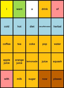
This section of this web page is primarily concerned with crateing text based communication systems with the Voice Symbol program. If you are not using Voice Symbol then you should skip this particular section.
Text-based systems are reasonably easy to create within Voice Symbol. As the sound file is attached to the symbol, you must first build a complete symbol board with the symbols for the text items that are required.
Then, when complete:
1. Order everything using the system ordering tools as required;
2. Select everything on the board (CTRL-A)
3. Turn the ‘Image OFF’ from using the Menu Bar icon. All symbols will disappear.
4. Align the text at top, middle, or bottom of cell using the Align text function.
5. Set the required font from the Board Tab. Choose a font that is easy to read and
can be clearly seen by the intended Learner(s).
6. Resize the text as necessary to fit the cells from the Board Tab. This can be done
individually or all at once.
7. Set the text colour as required.
8. Set the cell background colour as required or leave white.
9. Test the board in full screen mode.
10. Print the board.
Remember, the text on the board can just be a label for an underlying longer message. Messages can be recorded directly into the cells or a Text To Speech system can be used if available.
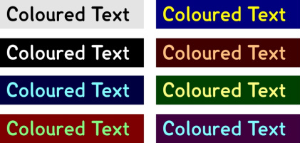
Black text on a white background is easier to see and will also save on printer ink costs. Other colour combinations are available
by selecting a specific background colour and changing the font colour. Some font and background colour combinations will make the text very difficult to read.
Spelling Board Systems
|
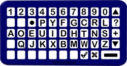
Alphabetic Layout
Qwerty Layout
Dvorak (Frequency of Use) Layout
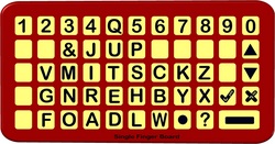
Single Finger Layout
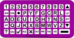
Modified Dvorak
|
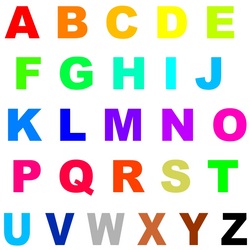
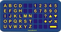
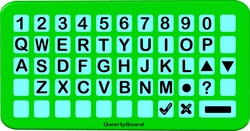
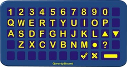
There are many possible arrangements of alpha-numeric layouts on a spelling board. However, typically, only a few arrangements are commonly used. Arrangements of the characters is dependent upon: - the accessing method employed; - the visual, physical and cognitive needs of the individual; - Learner preference. Alphabetic layouts include: - Alphabetic; - QWERTY; - Dvorak (Frequency of use); - Single finger pointing; - Head stick pointing; - Eye gaze; - Encoded; - F.A.S.T. (see Sure Start Sheet 2) - Other. Layouts can: - utilise different colour foregrounds and backgrounds. - have both UPPER and lower case formats as well as a combination of the two. - vary the number of columns and rows. - incorporate additional frequently used vocabulary as well as personal and social vocabulary. In the three columns below are listed the relative frequencies for the occurences of the letters in the English language. The first column lists the letters in order of frequncy (highest first). The second column lists the percentage makeup of the letter as a total of the whole when rounded up or down to the nearest whole number (except for the final four). The third column provides the frency of each letter when compared to that of the lette Q which is set at one. Thus, the letter e is 57 times more likely to occur in any given piece of text than q or, to put it another way, there will be 57 letter 'e' for every single 'q' in any given piece of text.
|
However, the table has a flaw! It was calculated by taking all the words in OED and then figuring out the letter use. That would be perfect if we used all the words in the OED equally but we already know that we do not do that: some words are used much more frequently that others. The word 'the' is used much more frequently than 'episodic' for example. It word therefore be better to take the texts of several newspapers, books, magazines and transcriptions of spoken conversations and analyse those for the frequency of the letters. However, I was unable to find any site which listed the alphabet in this way. If you know of one ... please contactt me! However, it will probably be very similar to the above listing although some letters may swap with their neighbours.
The QWERTY overlay was originally devises by Christopher Sholes in 1873 in Milwaukee, Wisconsin for the Sholes and Glidden typewriter. It underwent some few alterations by Remington who purchased the system but essentially has stayed in the same format to this day. It was not essentially designed for speed but, rather, as the best layout for speed which would prevent the mechanical systems on the first typewriters from jamming together during use. Even though this is not a condition of modern electronic systems the design remains stubbornly in force even though a more ergonomic layout would lead to faster typing speeds. Mrs. Barbara Blackburn of Salem, Oregon maintained a speed of 150 wpm for 50 min (37,500 key strokes) and attained a speed of 170 wpm using the Dvorak Simplified Keyboard system. Her top speed was recorded at 212 wpm (McWhirter, N. [ed.] 1985,The Guinness Book of World Records). Other sources quote a lady by the name of Stella Pajunas in 1946 achieving a staggering 216 words a minute. However, that is beyond the realms of mere mortals and all would benefit from a different layout although, after amny have tried, the QWERTY format remains dominant. It is for this reason that many people provide QWERTY layouts to individuals with disabilities, maintaining that it is better that they learn a system that will encounter everywhere than a non-standard alternative even if it would eventually be quicker for them.
If you are pecking at a keyboard with a single finger of a headstick then the QWERTY layout is definitely not the most efficent. A more efficent layout would organise the keys such that the letters that more commonly occur together in words are close together on the keyboard reducing the amount of movement required and, therefore, the physical effort. However, many people will still argue that QWERTY becasue of its domination should be used. Of course, if people keep arguing on those lines then QWERTY will always remain dominant! The decision is yours!
Text Labels
It is generally considered good practice to have a text label accompanying a symbol. While not all symbol users will become literate, repeated exposure to the word with the symbol may eventually lead to sight recognition. The label should be of suffcient a size to be clear to the Learner.
Label Position
Generally, text should be above the symbol rather than underneath. This is so that:
- as Learners or others point to a symbol their hand does not obscure the text.
- the Learner can always see the text to re-enforce literacy skills.
- the ‘listener’ always has an un-obscured vision of the text accompanying the symbol
(Not every listener will be familiar with the symbols used and will rely on the text
accompaniment).
Label Case
Text should generally be lower-case, well spaced, sans serif format, with a clear distinction between the letters that many people confuse (b and d for example). A good text to use is the Lexia font which is available for free download for non-commercial use here:
http://www.fontriver.com/font/lexia/
Text and Background Colour
The text colour chosen should form a good contrast with the background, Black on white is not always best. Indeed, it is not the recommended colour scheme for dyslexics which should be a dark colour on a light coloured background. Off white or a grey white is better than pure
white.
A good free introductory paper on the use of accessible text is available from Call Scotland:
http://www.callscotland.org.uk/Resources/Books/#Accessible Text: Guidelines for Good Practice
While, it may be argued that the use of the V-Pen makes the need for text labels no longer necessary, it should be remembered that the boards produced with Voice Symbol will not always be used with the V-pen and can operate as a standard communication board system as any time when the V-Pen is not available. Furthermore, hearing a word does not compensate for seeing it where developing literacy is concerned.
What if the text does not fit in the cell?
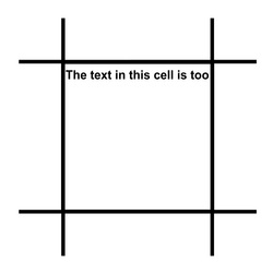
When working with single word vocabularies this does not pose too great a problem. However, when adopting a sentence based approach, it can be a bit difficult to fit all the sentence inside the cell. In many systems text can occupy one line only. Therefore, after the line reaches the wall of the cell, the remaining text cannot be seen as it disappears off the end of the line (i.e. text does not wrap around). Even in instances in which text wraps, it may be that doing so causes the symbol to shrink in size and have less clarity or even the text and the symbol to clash.
There are, at least, three ways of dealing with this problem:
1. Reduce the size of the font used. This may allow all the text to be displayed. However,
too small a font size is not good for visual clarity.
2. Alter the text to provide a shortened form of the message. Therefore, the text displayed is NOT the text that is spoken. For example,
if the text label originally said, ‘The text in this cell is too big to be all displayed’, it could be replaced with a shorter message that will
remind you of the longer message form that will be spoken: ‘text too big’.
3. Truncate the text in some manner to make it shorter. For example, 'rmv th vwls' or remove the words that are of less importance to the
sense of the message. We are all familiar with this approaching because of the use of texting on phones.
Of course, on a low tech communication baord, making the text message different to that which is intended is of no use: it only works if there is a spoken output.
Literacy and Communication Systems

There is a growing awareness of the importance of literacy in AAC supported by an ever increasing amount of presentations, reference materials and publications. It is therefore important that this page makes mention of the need for an awareness of the development of such skills when creating communication boards.
“For persons who are unable to use their speech to help them in their literacy ascent, their AAC system can make a unique contribution to both the instructional scaffolding that supports their learning and the language foundation upon which the scaffolding depends.”
Shirley McNaughton (Blissymbolics 2006)
Literacy is important in virtually all aspects of our daily lives. It is fundamental in Education, at work, in accessing the internet, in communicating with friends (e-mailing and texting for example), ...
Literacy is an important tool for AAC too. Without it, it is impossible to access the many thousands of fringe words in a language: without it, the Learner is limited to those fringe words that are provided by the system in use. While fringe words may only be required infrequently, never-the-less, when you want to say ‘triceratops’ it is nice to be able to do so without playing twenty questions with the listener.
Literacy and AAC has been covered in depth in a separate section of this web site. To move to that section simply click on the symbol above left. Use your browser's back button to return to this page.
Download the Sure Start Sheet for this Page

Click on the download image (left) to download the Sure Start Sheet for this page.
Each Sure Start Sheet is a Microsodt Word document.
It may be freely used for non-commercial purposes.
Back to the Creating Communication Books main page or move to the Top of Page
Click on the Left Arrow below to return to the Main Creating Communication Books and Boards Page
or
Hit the Up Arrow to return to the top of this page.
or
Hit the Up Arrow to return to the top of this page.
